Komoot navigation redesign
A ground-up redesign of the outdoor navigation experience for Europe’s leading route planning app
When
June 2024 - April 2025
Squad
Design Lead (me)
iOS, Android and Backend engineers
Product Manager
Data Analyst
QA
UX writer
Results
My squad’s work reached beta right before Bending Spoons acquired komoot and the team was restructured. The redesigned navigation was completed and released a year later in the Android app, and remains the navigation experience in the app today, with further navigation features built on top of it through 2026.
“Full ground-up rebuild of the 10-year-old Android navigation and recording stack. More reliable rerouting, clearer alerts, mid-recording route switching, an interactive elevation profile, and dozens of UX upgrades.”
The Challenge
By 2025 komoot had grown into Europe's leading route planning and navigation app, with 45 million registered users. The core navigation experience was still running on a stack built more than a decade earlier.
For riders and hikers, that showed up in two ways: a cluttered interface that distracted from the map, and no way to adjust a route once you were out on the trail. The experience had also drifted apart between iOS and Android. For the team, it meant even small fixes were expensive and A/B tests slows and costly.
The brief was to rebuild navigation from the ground up, and to evolve it into a system that can respond to variable outdoor conditions and changing plans mid-adventure.
As lead designer on the Navigation squad, I owned the redesign end to end: research, detailed design, and implementation support with engineers across iOS, Android and Garmin.
2. The user journey
Typically komoot users start by planning a route in the web app or get inspiration from other users >>>
>>> Once happy with the route, users would save it to their phone for navigation or send to the komoot app on Garmin cycling computers
3. Understanding user needs
‘Regular enthusiasts’ was our target persona
This included a diverse range of monthly and weekly active users across multiple sport types (cyclists, hikers, mountain bikers, trail runners). Further dive into analytics and user interviews allowed to build deeper understanding of their navigation experience needs.
User research
I started by reviewing previously conducted field studies. To quantify the key themes and understand the biggest UX issues with Komoot’s maps and navigation, I ran a survey and carried out user interviews.
Key insights:
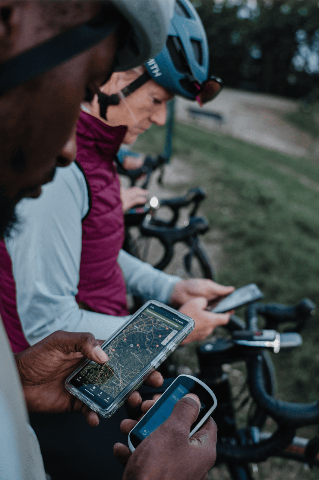
Hikers and runners mostly keep the phone in the pocket or bag, while listening to audio instructions and glancing at their sports watch. This means the komoot app is more of a companion experience and more focus needs to be on audio feedback.
Cyclists often have the phone in front of them on the handlebars and sometimes get confused by the maps or can’t find certain functions (while moving at fast speeds!). Maximising the map real estate, making visual instructions very clear and making stats glanceable is much more critical.
Analysis of field test recordings (under NDA)
Survey of existing users and their pain points (under NDA)
‘In the wild’ Field testing
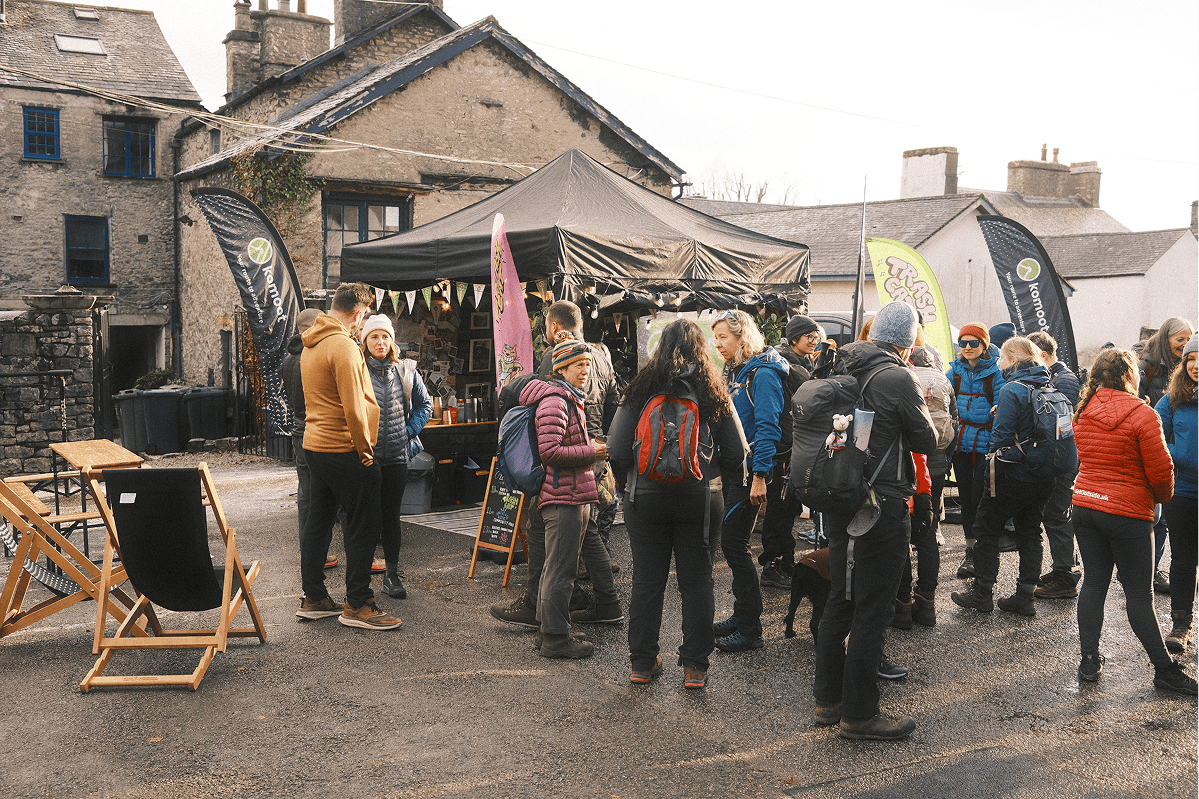
In order to deepen the understanding of the user needs, I went to Kendal Mountain Festival in the Lake District, where I tested prototypes with users in the real outdoor environments. Speaking to people at the komoot stand or during community hikes, I felt their authentic engagement with the product and got higher quality feedback.
Learnings:
Clear and easy to read map view was the key user need
Turn by turn instructions and stats are helpful to some, but the needs differed depending on their context. I realised that the ability to customise which elements are visible on screen at different points in the adventure was critical.

AI workflow
At the festival I gathered a lot of unstructured data (notes, interviews, observations). With the help of Google’s Notebook LM tool I was able to generated rapid insights and turn them into design decisions quickly.
4. Incremental design process
I worked closely with my squad colleagues to design new UI, test prototypes with users, refine and support delivery and QA. Gradually we built out the new experience for navigation and recording of routes.
Use case analysis
I led a workshop to identify elements and actions on the screen that are most and least important, and considering roadmap plans for each feature.

Designs flows creation
I explored and iterated through multiple design concepts, taking in regular feedback from squad team members and the wider design team.
One big constraint was working within the legacy design system and brand guidelines that were in the process of being revamped.
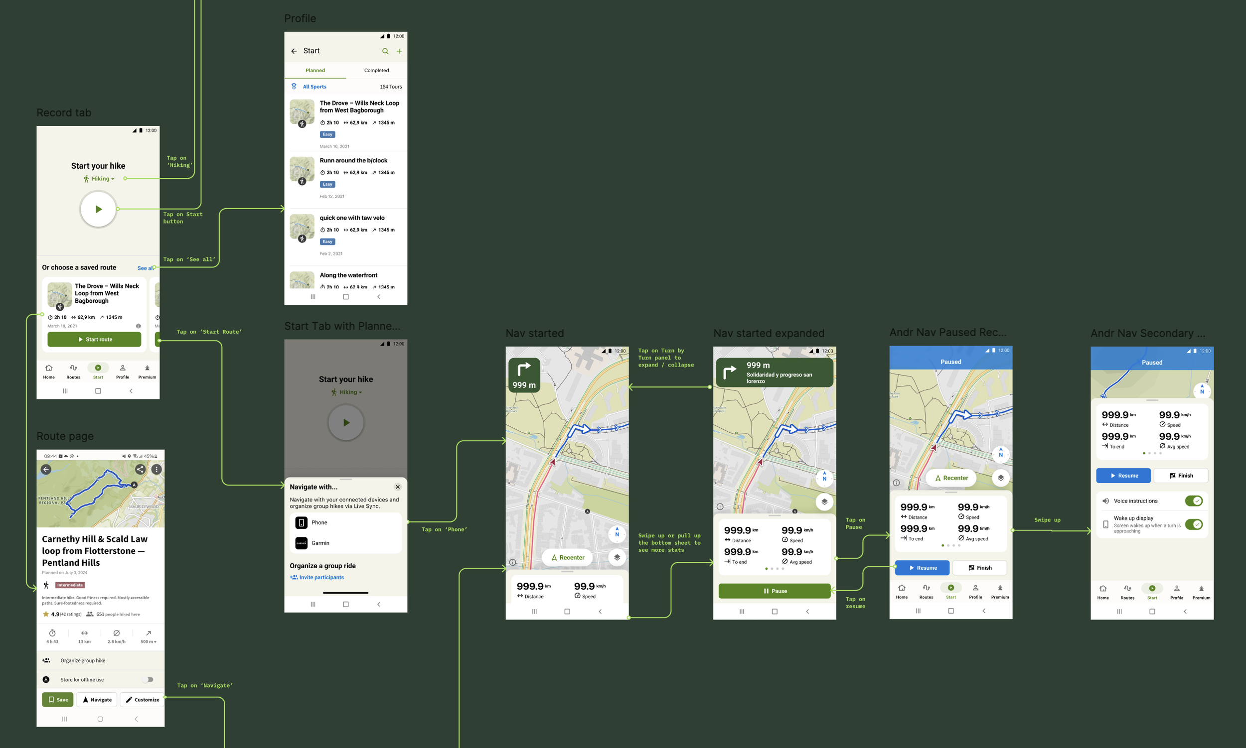
Planning delivery stages
Released in stages to internal users and tested builds in real, diverse outdoor conditions. It wasn’t possible to release to the public gradually. The architecture underneath was being replaced, so there was no way to give the new navigation to a small percentage of users, and no way to A/B test against the old code.
To de-risk the public release, we ran remote usability sessions on concepts early, kept aligned with the other squads and prepared a beta testing programme. Komoot got acquired days 2 days before the beta testing was due to start.

6. Components design
The insight that different user groups wanted to customise their map experience in different ways led the a complete rethink of the turn-by-turn navigation module. Through multiple design iterations I explored edge cases, technical constraints and various states of the panels. Together with a UX writer, I refined messaging for activity notifications and alerts.
Specs handoff to developers
I worked closely with the engineers to develop specifications for the new components and integrated them into komoot’s design system.
Animations and transition
I created a ProtoPie interactive prototype and specifications (e.g. timings, curve) to communicated intended behaviour with the developers. We fine tuned the components together through feature builds.
7. Navigation Improvements on Garmin devices
Alongside mobile apps, I also supported improvements for navigation on Garmin cycling computers and watches. Users had been requesting the ability to add custom Points of Interest (POIs) like cafes or shops to their routes and see them pop up on screen while they are navigating.
I reviewed the existing POI experience across Komoot planner on the web and in the apps, and created various design directions reusing components and suggesting improvements. The key challenge was to make POIs appear clearly on small Garmin displays, without obstructing the route line.
Specs for the Garmin developer and QA detailing POI icon positioning and various states
Garmin public release with the POIs feature
8. Key results
Shipped experience
The redesigned navigation experience ended up being launched on Android a year later (2026). It remains the navigation experience in the app today.
A companion POI feature rolled out to thousands of Garmin users in April 2025, working within the constraints of small monochrome displays and limited memory.
New components designed, documented and built into komoot's design system.
Specs, motion and interaction detail were documented thoroughly enough that the Android build was completed after I'd left, by the engineer I'd worked with throughout.
Metrics
Has the acquisition not happened, the measures I would have wanted to impact were: increased navigation duration and number of routes navigated each month, number of mid-activity adjustments and reduction in accidental pauses.
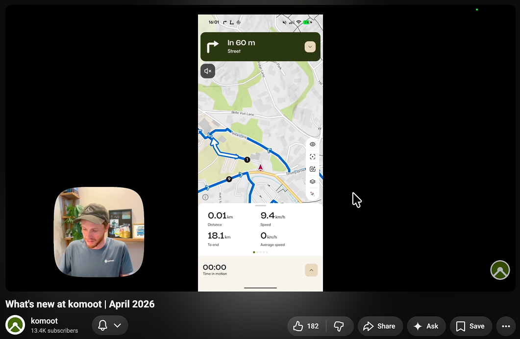
Komoot showcasing the new navigation in Android in the April 2026 release video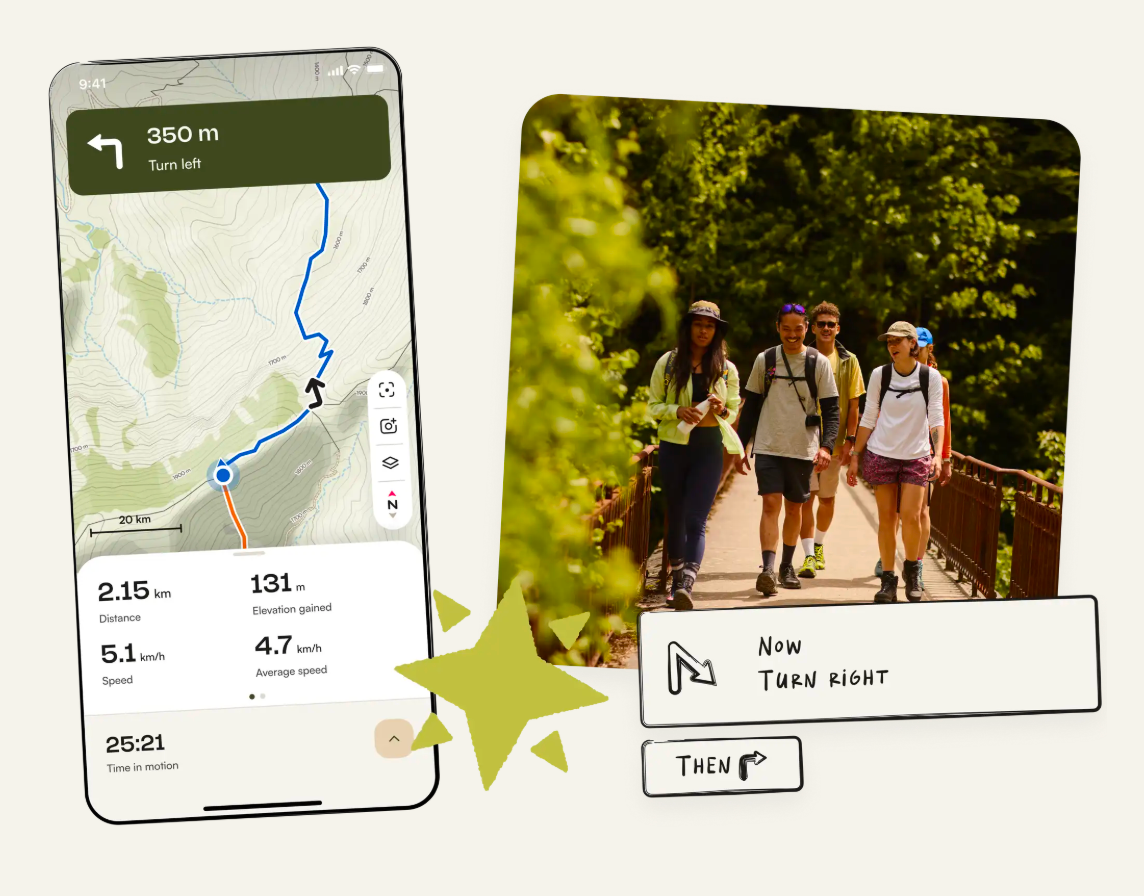
Komoot’s website promoting the new navigation featuresKey learnings:
User behaviour: Field testing in a variety of conditions (cold, wet, sunny, in motion) significantly influenced tap areas, sizes of elements, contrast and UI customisation
Technical: Maps, route lines, map tiles and GPS are complex - requires deep technical understanding and collaboration with backend, frontend and routing engineers.
Content: Designing for edge cases from the start, such as localisation where a German word can easily break the whole layout.